
2026
Rebranding
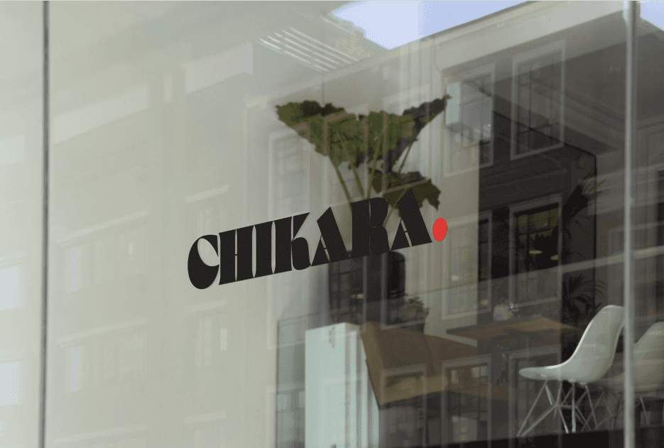
Chikara is a sushi restaurant based in Sollentuna in need of a clearer and more contemporary visual presence. The goal of the rebrand was to create a cohesive identity that felt modern and confident while still reflecting the precision and craft behind the food.
The project included a full visual refresh — a new logo, updated typography and a refined visual system designed to work consistently across in-store materials, digital platforms and motion. Subtle motion elements were developed to bring the identity to life on screens and social formats, adding a sense of rhythm and atmosphere that aligned with the dining experience.
The new direction focused on clarity, balance and recognisable visual cues, creating an identity that feels both elevated and accessible. From logo design to motion assets, the rebrand aimed to strengthen Chikara’s presence and create a more unified brand experience across all touchpoints.
Rebranding
Graphics
Know More
Chikara’s rebrand was developed across branding, motion and visual communication.
From logo design to moving visuals, the identity was shaped into a clear, modern expression with precision and intent.
Chikara — Rebrand
Working with S3 elevated how we present Chikara as a brand.
From the first concept to the final rollout, the process was clear and professional. Every detail felt considered, and the new identity is modern, cohesive and perfectly aligned with our vision.

Problem
The event lacked a cohesive visual direction that could match the precision and atmosphere of the sake being presented. Existing materials felt fragmented and generic, making it difficult to create a clear identity or a consistent experience across screens and the physical space. Without a refined visual system and considered motion, the event risked feeling disconnected rather than immersive. The task was to develop a modern, cohesive visual language that could elevate the atmosphere while supporting the product and overall experience.
In a competitive restaurant landscape, building a brand that feels both distinctive and cohesive is essential. Many local restaurants rely on inconsistent visuals or outdated identities, which can weaken the overall impression and make it harder to stand out. For Chikara — a sushi restaurant rooted in precision, craft and balance — the visual identity needed to reflect the quality of the food while feeling modern, clear and recognisable across all touchpoints.
The rebrand for Chikara was developed to create that clarity and cohesion. The goal was to build a refined visual language that could live consistently across logo, in-store materials, digital platforms and motion. A new logo, updated typography and a simplified design system were introduced to create a more confident and contemporary presence.
Subtle motion elements were also developed to bring the identity to life on screens and social platforms, adding rhythm and atmosphere while keeping the brand clean and focused. Every element was shaped to feel precise, modern and intentional.
The result is a unified visual identity that better reflects Chikara’s quality and personality — creating a stronger presence both in the restaurant and across digital channels.


Solution
With a focus on clarity, precision and consistency, the Chikara rebrand transforms the restaurant’s visual presence into a cohesive and modern brand experience. The new identity brings together logo, motion and visual communication to create a stronger and more recognisable presence across every touchpoint.
The rebrand for Chikara was developed to redefine how the restaurant communicates through design. The approach combined creativity, strategy and functionality to create a visual identity that feels both refined and effective. Every element — from the new logo to motion and supporting visuals — was designed with purpose, ensuring a cohesive experience that strengthens the brand’s storytelling across both physical and digital spaces.
By introducing a clearer visual system and a more contemporary aesthetic, the new identity helps Chikara stand out in a competitive restaurant landscape while remaining true to its craft and character. The project balanced visual impact with practical application, ensuring the brand works consistently across signage, menus, screens and social platforms.
The process was collaborative and detail-driven, aligning the visual direction with the restaurant’s vision and atmosphere. The result is a unified and modern brand experience that connects design decisions with real-world use, creating a stronger and more recognisable presence for Chikara.
Concept
The concept marks a new direction for Chikara — where refined aesthetics and clear strategy work together to create a modern, cohesive brand identity.
The rebrand for Chikara was built on the idea that design should do more than look good — it should create a clear identity, shape an experience and leave a lasting impression. The concept focused on balancing aesthetics with functionality, ensuring that every element of the new visual system served a purpose and worked consistently across both physical and digital environments.
With an emphasis on clarity, storytelling and precise execution, the new identity was designed to strengthen how Chikara communicates as a brand. From logo and typography to motion and supporting visuals, each component contributes to a cohesive experience that feels modern, intentional and recognisable.
The goal was to move beyond a simple visual refresh and instead create a unified brand direction that blends craft, atmosphere and contemporary design thinking. The result is a refined identity that helps Chikara stand out while staying true to its character — built to engage, feel considered and last over time.

More Works
(S3® — 01)
#2026


2026
Rebranding
Chikara is a sushi restaurant based in Sollentuna in need of a clearer and more contemporary visual presence. The goal of the rebrand was to create a cohesive identity that felt modern and confident while still reflecting the precision and craft behind the food.
The project included a full visual refresh — a new logo, updated typography and a refined visual system designed to work consistently across in-store materials, digital platforms and motion. Subtle motion elements were developed to bring the identity to life on screens and social formats, adding a sense of rhythm and atmosphere that aligned with the dining experience.
The new direction focused on clarity, balance and recognisable visual cues, creating an identity that feels both elevated and accessible. From logo design to motion assets, the rebrand aimed to strengthen Chikara’s presence and create a more unified brand experience across all touchpoints.
Rebranding
Graphics
Know More
Chikara’s rebrand was developed across branding, motion and visual communication.
From logo design to moving visuals, the identity was shaped into a clear, modern expression with precision and intent.
Chikara — Rebrand
Working with S3 elevated how we present Chikara as a brand.
From the first concept to the final rollout, the process was clear and professional. Every detail felt considered, and the new identity is modern, cohesive and perfectly aligned with our vision.
Problem
The event lacked a cohesive visual direction that could match the precision and atmosphere of the sake being presented. Existing materials felt fragmented and generic, making it difficult to create a clear identity or a consistent experience across screens and the physical space. Without a refined visual system and considered motion, the event risked feeling disconnected rather than immersive. The task was to develop a modern, cohesive visual language that could elevate the atmosphere while supporting the product and overall experience.
In a competitive restaurant landscape, building a brand that feels both distinctive and cohesive is essential. Many local restaurants rely on inconsistent visuals or outdated identities, which can weaken the overall impression and make it harder to stand out. For Chikara — a sushi restaurant rooted in precision, craft and balance — the visual identity needed to reflect the quality of the food while feeling modern, clear and recognisable across all touchpoints.
The rebrand for Chikara was developed to create that clarity and cohesion. The goal was to build a refined visual language that could live consistently across logo, in-store materials, digital platforms and motion. A new logo, updated typography and a simplified design system were introduced to create a more confident and contemporary presence.
Subtle motion elements were also developed to bring the identity to life on screens and social platforms, adding rhythm and atmosphere while keeping the brand clean and focused. Every element was shaped to feel precise, modern and intentional.
The result is a unified visual identity that better reflects Chikara’s quality and personality — creating a stronger presence both in the restaurant and across digital channels.
Solution
With a focus on clarity, precision and consistency, the Chikara rebrand transforms the restaurant’s visual presence into a cohesive and modern brand experience. The new identity brings together logo, motion and visual communication to create a stronger and more recognisable presence across every touchpoint.
The rebrand for Chikara was developed to redefine how the restaurant communicates through design. The approach combined creativity, strategy and functionality to create a visual identity that feels both refined and effective. Every element — from the new logo to motion and supporting visuals — was designed with purpose, ensuring a cohesive experience that strengthens the brand’s storytelling across both physical and digital spaces.
By introducing a clearer visual system and a more contemporary aesthetic, the new identity helps Chikara stand out in a competitive restaurant landscape while remaining true to its craft and character. The project balanced visual impact with practical application, ensuring the brand works consistently across signage, menus, screens and social platforms.
The process was collaborative and detail-driven, aligning the visual direction with the restaurant’s vision and atmosphere. The result is a unified and modern brand experience that connects design decisions with real-world use, creating a stronger and more recognisable presence for Chikara.
Concept
The concept marks a new direction for Chikara — where refined aesthetics and clear strategy work together to create a modern, cohesive brand identity.
The rebrand for Chikara was built on the idea that design should do more than look good — it should create a clear identity, shape an experience and leave a lasting impression. The concept focused on balancing aesthetics with functionality, ensuring that every element of the new visual system served a purpose and worked consistently across both physical and digital environments.
With an emphasis on clarity, storytelling and precise execution, the new identity was designed to strengthen how Chikara communicates as a brand. From logo and typography to motion and supporting visuals, each component contributes to a cohesive experience that feels modern, intentional and recognisable.
The goal was to move beyond a simple visual refresh and instead create a unified brand direction that blends craft, atmosphere and contemporary design thinking. The result is a refined identity that helps Chikara stand out while staying true to its character — built to engage, feel considered and last over time.
More Works
(S3® — 01)
#2026
2026
Rebranding
Chikara is a sushi restaurant based in Sollentuna in need of a clearer and more contemporary visual presence. The goal of the rebrand was to create a cohesive identity that felt modern and confident while still reflecting the precision and craft behind the food.
The project included a full visual refresh — a new logo, updated typography and a refined visual system designed to work consistently across in-store materials, digital platforms and motion. Subtle motion elements were developed to bring the identity to life on screens and social formats, adding a sense of rhythm and atmosphere that aligned with the dining experience.
The new direction focused on clarity, balance and recognisable visual cues, creating an identity that feels both elevated and accessible. From logo design to motion assets, the rebrand aimed to strengthen Chikara’s presence and create a more unified brand experience across all touchpoints.
Rebranding
Graphics
Know More
Chikara’s rebrand was developed across branding, motion and visual communication.
From logo design to moving visuals, the identity was shaped into a clear, modern expression with precision and intent.
Chikara — Rebrand
Working with S3 elevated how we present Chikara as a brand.
From the first concept to the final rollout, the process was clear and professional. Every detail felt considered, and the new identity is modern, cohesive and perfectly aligned with our vision.
Problem
The event lacked a cohesive visual direction that could match the precision and atmosphere of the sake being presented. Existing materials felt fragmented and generic, making it difficult to create a clear identity or a consistent experience across screens and the physical space. Without a refined visual system and considered motion, the event risked feeling disconnected rather than immersive. The task was to develop a modern, cohesive visual language that could elevate the atmosphere while supporting the product and overall experience.
In a competitive restaurant landscape, building a brand that feels both distinctive and cohesive is essential. Many local restaurants rely on inconsistent visuals or outdated identities, which can weaken the overall impression and make it harder to stand out. For Chikara — a sushi restaurant rooted in precision, craft and balance — the visual identity needed to reflect the quality of the food while feeling modern, clear and recognisable across all touchpoints.
The rebrand for Chikara was developed to create that clarity and cohesion. The goal was to build a refined visual language that could live consistently across logo, in-store materials, digital platforms and motion. A new logo, updated typography and a simplified design system were introduced to create a more confident and contemporary presence.
Subtle motion elements were also developed to bring the identity to life on screens and social platforms, adding rhythm and atmosphere while keeping the brand clean and focused. Every element was shaped to feel precise, modern and intentional.
The result is a unified visual identity that better reflects Chikara’s quality and personality — creating a stronger presence both in the restaurant and across digital channels.
Solution
With a focus on clarity, precision and consistency, the Chikara rebrand transforms the restaurant’s visual presence into a cohesive and modern brand experience. The new identity brings together logo, motion and visual communication to create a stronger and more recognisable presence across every touchpoint.
The rebrand for Chikara was developed to redefine how the restaurant communicates through design. The approach combined creativity, strategy and functionality to create a visual identity that feels both refined and effective. Every element — from the new logo to motion and supporting visuals — was designed with purpose, ensuring a cohesive experience that strengthens the brand’s storytelling across both physical and digital spaces.
By introducing a clearer visual system and a more contemporary aesthetic, the new identity helps Chikara stand out in a competitive restaurant landscape while remaining true to its craft and character. The project balanced visual impact with practical application, ensuring the brand works consistently across signage, menus, screens and social platforms.
The process was collaborative and detail-driven, aligning the visual direction with the restaurant’s vision and atmosphere. The result is a unified and modern brand experience that connects design decisions with real-world use, creating a stronger and more recognisable presence for Chikara.
Concept
The concept marks a new direction for Chikara — where refined aesthetics and clear strategy work together to create a modern, cohesive brand identity.
The rebrand for Chikara was built on the idea that design should do more than look good — it should create a clear identity, shape an experience and leave a lasting impression. The concept focused on balancing aesthetics with functionality, ensuring that every element of the new visual system served a purpose and worked consistently across both physical and digital environments.
With an emphasis on clarity, storytelling and precise execution, the new identity was designed to strengthen how Chikara communicates as a brand. From logo and typography to motion and supporting visuals, each component contributes to a cohesive experience that feels modern, intentional and recognisable.
The goal was to move beyond a simple visual refresh and instead create a unified brand direction that blends craft, atmosphere and contemporary design thinking. The result is a refined identity that helps Chikara stand out while staying true to its character — built to engage, feel considered and last over time.
More Works
#2026