
2026
Executive Living Rebrand
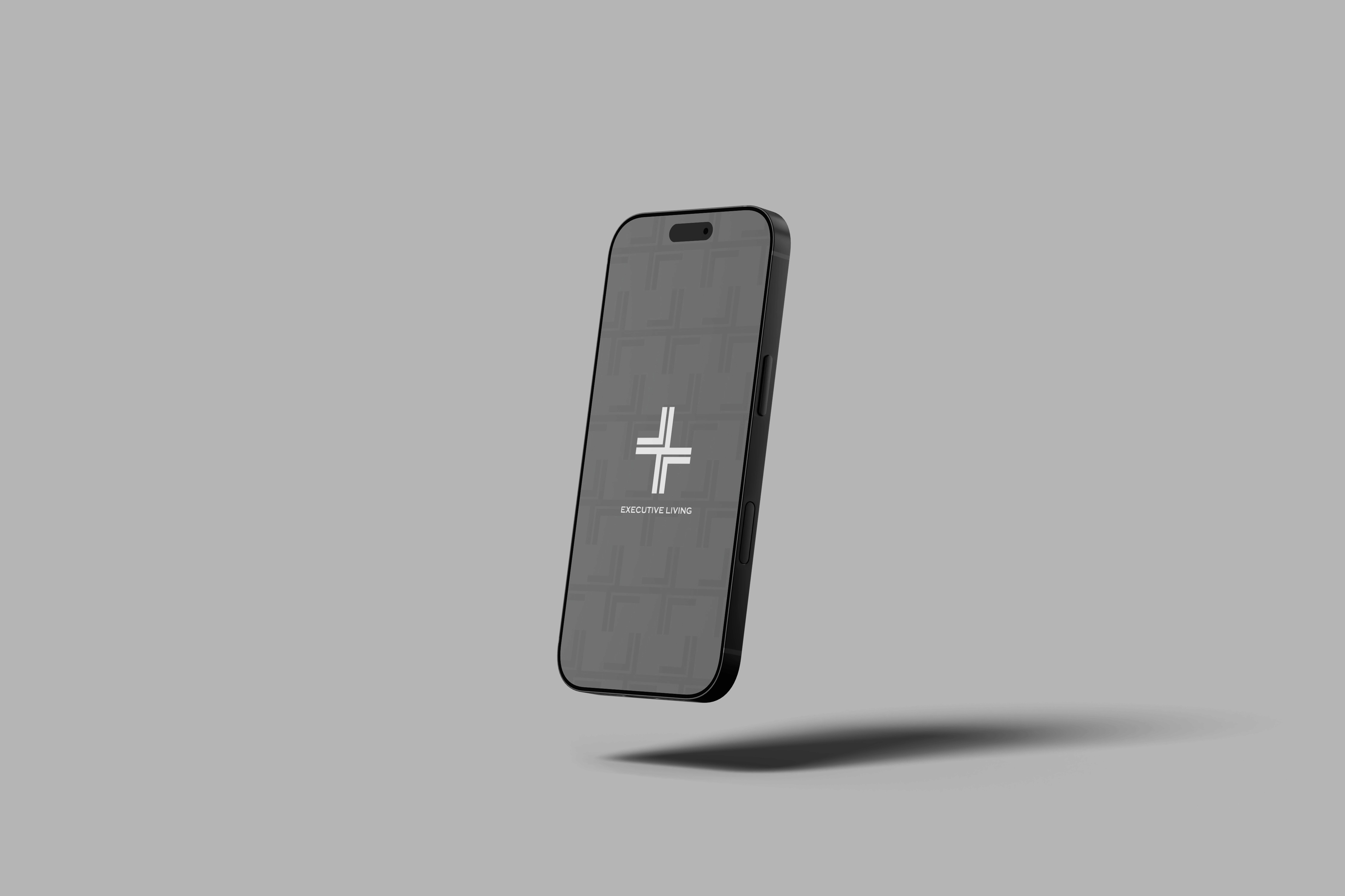
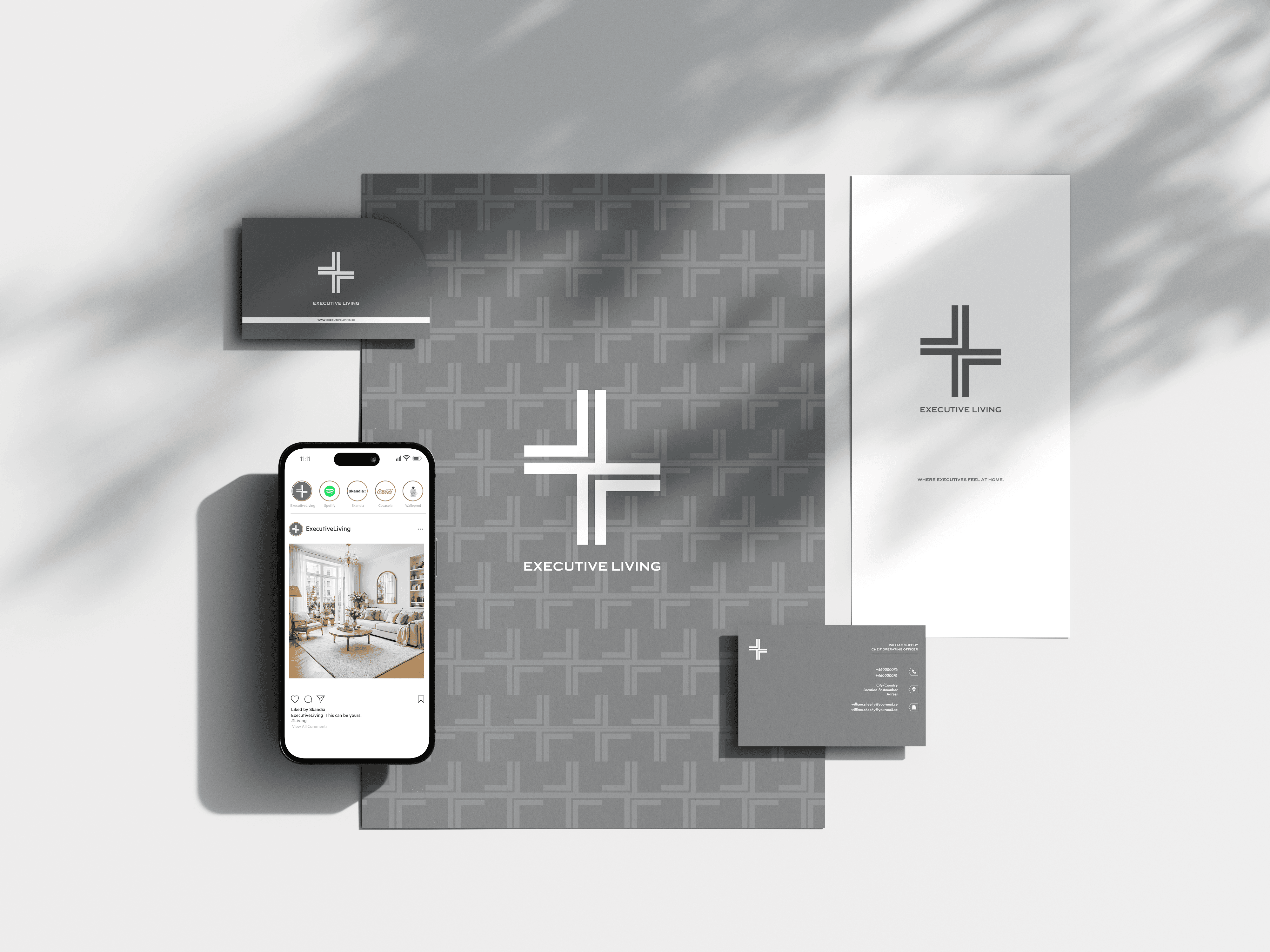
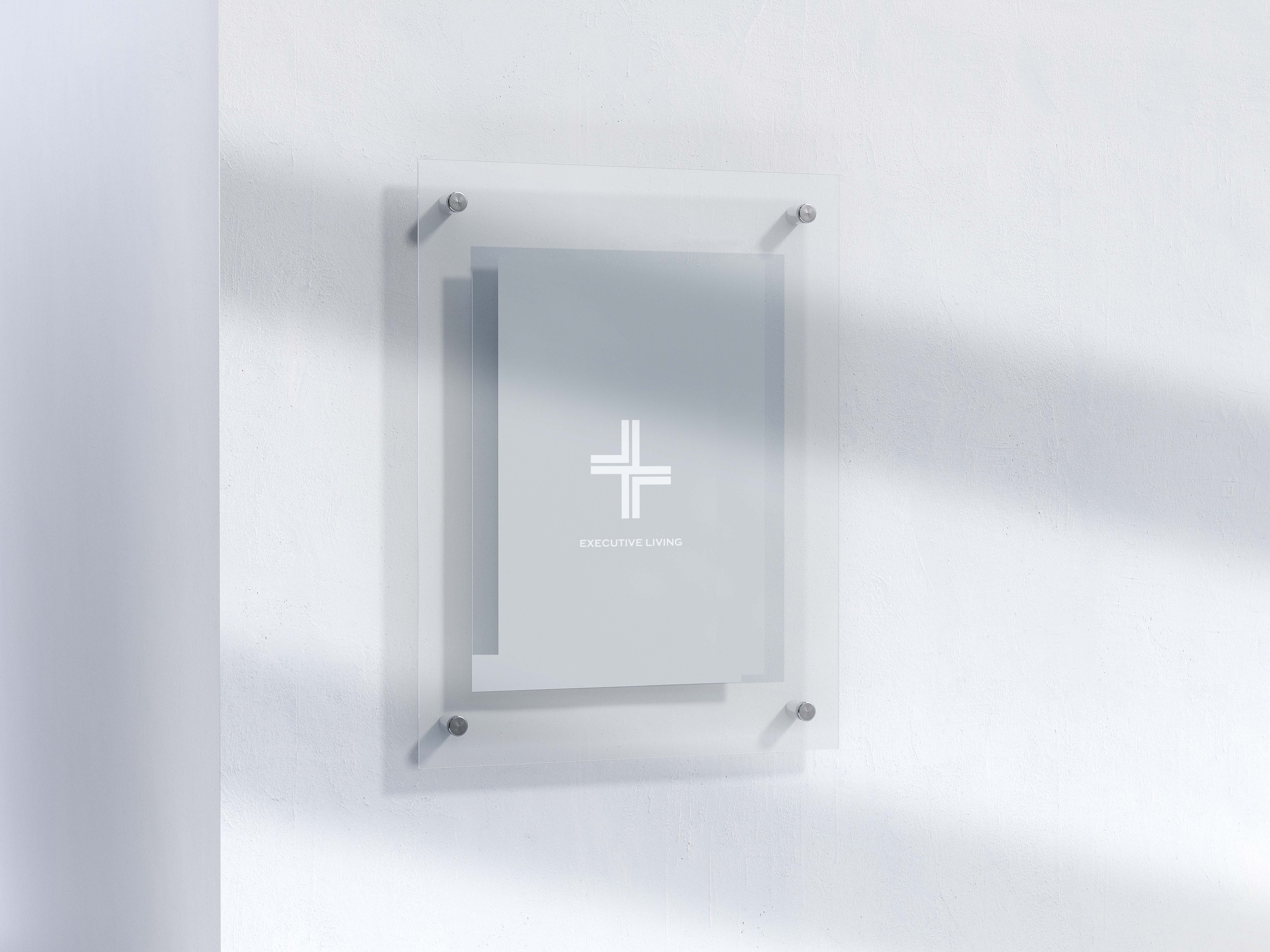
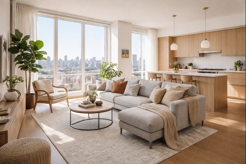
A gray, modern design inspired by minimalism and keeping it clean. Executive Living combines clean aesthetics with a modern touch.
Portfolio
Rebranding
Know More
Inspired by contemporary luxury and architectural precision, this project explores the balance between refined, modern aesthetics and a clear, user-focused brand experience.®
Top Rated Portfolio Around Everywhere
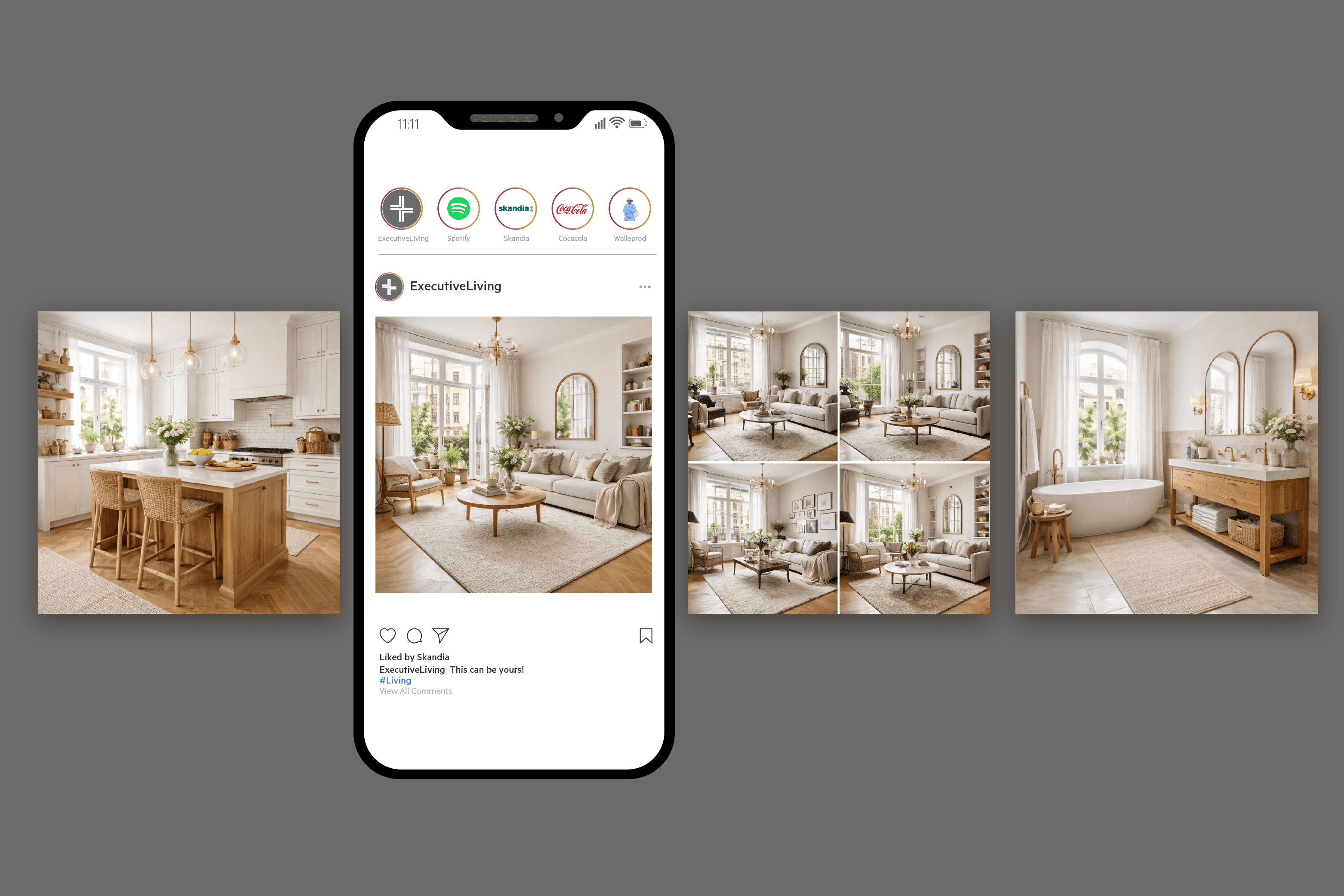
Inspired by modern architecture and premium living environments, this rebrand combines refined visuals with a structured, intuitive design system. The goal was to create a cohesive brand experience that feels both elevated and approachable—balancing strong visual identity, thoughtful layout, and consistent application across digital and print. From typography and color direction to layout and brand guidelines, the project establishes a clear foundation for Executive Living to communicate with confidence.
Problem
Balancing bold, eye-catching visuals with practical functionality required innovative thinking and a deep understanding of both form and function. Our goal was to craft an experience that not only captivates.
In today’s competitive property and lifestyle market, a clear and cohesive brand presence is essential. Executive Living’s previous visual identity lacked consistency across touchpoints, making it difficult to communicate the brand’s premium offering with clarity and confidence. Outdated layouts, inconsistent typography, and the absence of a structured brand system created challenges in maintaining a unified expression across marketing material and digital platforms.
This rebrand addresses those gaps by establishing a refined, modern identity built on strong visual hierarchy, clear guidelines, and scalable design principles. The result is a cohesive brand system that elevates perception, strengthens communication, and provides Executive Living with the tools needed to present its services in a consistent, high-end and user-focused way.
Solution
The rebrand for Executive Living was developed to replace an outdated and inconsistent visual presence with a refined, modern, and scalable brand system.
The rebrand for Executive Living addresses the need for a stronger and more cohesive brand presence. Beyond aesthetics, the focus was on clarity, usability, and consistency across all touchpoints. By establishing a structured visual system and clear guidelines, the new identity enables the brand to communicate confidently and maintain a premium, unified expression across digital and print. The result is a modern foundation that strengthens credibility, improves user experience, and supports long-term brand growth.
Concept
The rebrand for Executive Living is built to create a refined and high-performing brand presence that stands out in a competitive market, combining sleek visual design with clear, structured communication across all touchpoints.
A brand is more than visuals—it’s the first impression, the sense of trust, and the foundation for how a company is perceived. The rebrand for Executive Living focuses on creating a refined and memorable identity that communicates professionalism and clarity from the first touchpoint. Through a modern visual language, structured layouts, and consistent application across channels, the new identity ensures the brand stands out in a competitive market. Beyond aesthetics, usability and consistency were central to the process, resulting in a flexible design system that supports clear communication, strong brand recognition, and long-term growth.
More Works
(S3® — 01)
#2026


2026
Executive Living Rebrand
A gray, modern design inspired by minimalism and keeping it clean. Executive Living combines clean aesthetics with a modern touch.
Portfolio
Rebranding
Know More
Inspired by contemporary luxury and architectural precision, this project explores the balance between refined, modern aesthetics and a clear, user-focused brand experience.®
Top Rated Portfolio Around Everywhere
Inspired by modern architecture and premium living environments, this rebrand combines refined visuals with a structured, intuitive design system. The goal was to create a cohesive brand experience that feels both elevated and approachable—balancing strong visual identity, thoughtful layout, and consistent application across digital and print. From typography and color direction to layout and brand guidelines, the project establishes a clear foundation for Executive Living to communicate with confidence.
Problem
Balancing bold, eye-catching visuals with practical functionality required innovative thinking and a deep understanding of both form and function. Our goal was to craft an experience that not only captivates.
In today’s competitive property and lifestyle market, a clear and cohesive brand presence is essential. Executive Living’s previous visual identity lacked consistency across touchpoints, making it difficult to communicate the brand’s premium offering with clarity and confidence. Outdated layouts, inconsistent typography, and the absence of a structured brand system created challenges in maintaining a unified expression across marketing material and digital platforms.
This rebrand addresses those gaps by establishing a refined, modern identity built on strong visual hierarchy, clear guidelines, and scalable design principles. The result is a cohesive brand system that elevates perception, strengthens communication, and provides Executive Living with the tools needed to present its services in a consistent, high-end and user-focused way.
Solution
The rebrand for Executive Living was developed to replace an outdated and inconsistent visual presence with a refined, modern, and scalable brand system.
The rebrand for Executive Living addresses the need for a stronger and more cohesive brand presence. Beyond aesthetics, the focus was on clarity, usability, and consistency across all touchpoints. By establishing a structured visual system and clear guidelines, the new identity enables the brand to communicate confidently and maintain a premium, unified expression across digital and print. The result is a modern foundation that strengthens credibility, improves user experience, and supports long-term brand growth.
Concept
The rebrand for Executive Living is built to create a refined and high-performing brand presence that stands out in a competitive market, combining sleek visual design with clear, structured communication across all touchpoints.
A brand is more than visuals—it’s the first impression, the sense of trust, and the foundation for how a company is perceived. The rebrand for Executive Living focuses on creating a refined and memorable identity that communicates professionalism and clarity from the first touchpoint. Through a modern visual language, structured layouts, and consistent application across channels, the new identity ensures the brand stands out in a competitive market. Beyond aesthetics, usability and consistency were central to the process, resulting in a flexible design system that supports clear communication, strong brand recognition, and long-term growth.
More Works
(S3® — 01)
#2026
2026
Executive Living Rebrand
A gray, modern design inspired by minimalism and keeping it clean. Executive Living combines clean aesthetics with a modern touch.
Portfolio
Rebranding
Know More
Inspired by contemporary luxury and architectural precision, this project explores the balance between refined, modern aesthetics and a clear, user-focused brand experience.®
Top Rated Portfolio Around Everywhere
Inspired by modern architecture and premium living environments, this rebrand combines refined visuals with a structured, intuitive design system. The goal was to create a cohesive brand experience that feels both elevated and approachable—balancing strong visual identity, thoughtful layout, and consistent application across digital and print. From typography and color direction to layout and brand guidelines, the project establishes a clear foundation for Executive Living to communicate with confidence.
Problem
Balancing bold, eye-catching visuals with practical functionality required innovative thinking and a deep understanding of both form and function. Our goal was to craft an experience that not only captivates.
In today’s competitive property and lifestyle market, a clear and cohesive brand presence is essential. Executive Living’s previous visual identity lacked consistency across touchpoints, making it difficult to communicate the brand’s premium offering with clarity and confidence. Outdated layouts, inconsistent typography, and the absence of a structured brand system created challenges in maintaining a unified expression across marketing material and digital platforms.
This rebrand addresses those gaps by establishing a refined, modern identity built on strong visual hierarchy, clear guidelines, and scalable design principles. The result is a cohesive brand system that elevates perception, strengthens communication, and provides Executive Living with the tools needed to present its services in a consistent, high-end and user-focused way.
Solution
The rebrand for Executive Living was developed to replace an outdated and inconsistent visual presence with a refined, modern, and scalable brand system.
The rebrand for Executive Living addresses the need for a stronger and more cohesive brand presence. Beyond aesthetics, the focus was on clarity, usability, and consistency across all touchpoints. By establishing a structured visual system and clear guidelines, the new identity enables the brand to communicate confidently and maintain a premium, unified expression across digital and print. The result is a modern foundation that strengthens credibility, improves user experience, and supports long-term brand growth.
Concept
The rebrand for Executive Living is built to create a refined and high-performing brand presence that stands out in a competitive market, combining sleek visual design with clear, structured communication across all touchpoints.
A brand is more than visuals—it’s the first impression, the sense of trust, and the foundation for how a company is perceived. The rebrand for Executive Living focuses on creating a refined and memorable identity that communicates professionalism and clarity from the first touchpoint. Through a modern visual language, structured layouts, and consistent application across channels, the new identity ensures the brand stands out in a competitive market. Beyond aesthetics, usability and consistency were central to the process, resulting in a flexible design system that supports clear communication, strong brand recognition, and long-term growth.
More Works
#2026